

For reasons beyond my comprehension, my bank has recently upgraded the software on their ATM machines – from UX-Nightmare to UX-hell. Therefor I want to release this piece, hoping that maybe somebody responsible for this mess will read it. And thus allowing myself to strike off one big fat item, from my long list of first world problems.
So, what happened?
Up until now, every time I was in need of some cash, I hit the ATM, navigated through a strangely structured menu, pushed the button for "100€" and got my dollar dollar bills y‘all! These were always neatly split down into:
- 1 - 50€ bill
- 2 - 20€ bill
- 1 - 10€ bills
What a joy life was. Unfortunately, a few weeks ago my bank decided to change the way their machines work. Now, instead of the nice variety of dineros, all I am left with is a big green 100€ bill.
Why is this a problem?
To understand why this sucks, you first have to understand that Germans are weird when it comes to paying cash. When you buy something in Germany, there’s an unwritten social code underlying the transaction. You can’t just go out and buy yourself a nice brezel or currywurst, hundies in hand. Oh no! Common curtesy requires you to match the amount asked, as closely as possible. And to do so without wasting time, while retrieving the shekels from your wallet.
appropriate_seconds = abs(1.5*((YourAge-20)/2))
As a good citizen of Deutschland, I try to obey the social code in an exemplary manner. So, after receiving the big bill from the ATM, I found myself in line for the bank counters, along with two elderly women. The dames had both also been blessed, one with a single 100€ bill, the other with a two. We all needed smaller bills! In the end this ordeal extended the usual 30 seconds at the ATM, to something around seven minutes!
How it works right now
So how does the user flow at the ATM work currently? How many choices do I have to make before I end up where I want to be, and how comprehensible are they?
Sorry for the shitty pics, but I felt a bit thuggy while taking them, with the security dude eyeballing me the whole time.
Step 1

First, we have to choose what we'd like to do. Because, why would you visit an ATM at the first place? Maybe you'd like to change your PIN? Transfer money to you prepaid cellphone contract? No? Just Cash? Alright then, have it your way.
Step 2

Secondly, we have to decide how much money we'd like to withdraw. I personally, never exceed 150€, and I will withdraw 100€ most times I use this machine. And every time I’m in front of the screen, I marvel at the sight of the 1000€ button … and ask myself: Am I super ballin today? Then I realize that I'm not Jeff freaking Bezos, and target my usual 100€. This however will result in the intolerable 100€ bill, so now, I divert to the button labeled "Different amount & bill selection".
Step 3

Step 3 consists of two smaller decisions: First we need to enter the custom amount of money we'd like to get, and then we have to decide if we'd like to define the exact selection of bills, or just take whatever the machine throws at us.
Step 4
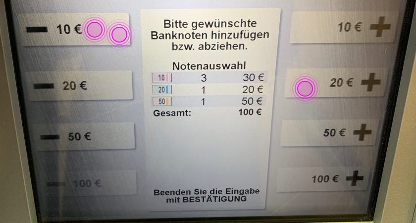
And here it is! The pinnacle of ATM interface design: the custom-bills screen. Even though it's supposed to be custom, the ATM will suggest a certain configuration of bills. I’m definitely not pleased with the proposal put forward by this devilish machine! And so, I just have to add a 20, and fiddle with the 10s. All of this tampering is now interfering with the amount I had entered initially. I feel like a 70 year old playing fortnite, slightly disturbed, until I have everything in place again. Finally I confirm my business on the num pad.
Step 5

Lastly, I'm asked to enter my PIN, after which the old machine clanks out my hard earned cash.
How it should work
Here is my proposed flow for an ATM machine: The way I ASSUME it would be fastest, given there aren't any reasons (legal or technical) that make this flow impossible.
This solution is based on the hypothesis that the most common action performed at an ATM is the withdrawal of money. In that case, the first decision a user should be confronted with, is how much money he would like to get. Not what he would like to do. All those other options, changing PIN, transfer money to a mobile phone etc., come second.
Step 1
By making the amount selection more visual, and giving the user the chance to select the bills he'd like, the action becomes more transparent, and what I see on the screen, is what I'll hold in my hands later on. I'd even go as far as to say that it makes it more accessible for people with reading difficulties or with a different language background, as all one has to read are numbers/pictures and mathematical signs.

Step 2
Enter Pin -> Get Money
Well, that was quick. Who'd have thought that something as complicated as getting cash could be this simple?
Certainly not my bank.